Hello everyone! You all know I love a great makeover – today’s is website related. I’m happy to announce that the new and improved Centsational Girl has finally arrived! Yesterday we launched the new site, I’m so delighted it has a fresh look and modern design and that it is finally mobile and tablet friendly, hooray!
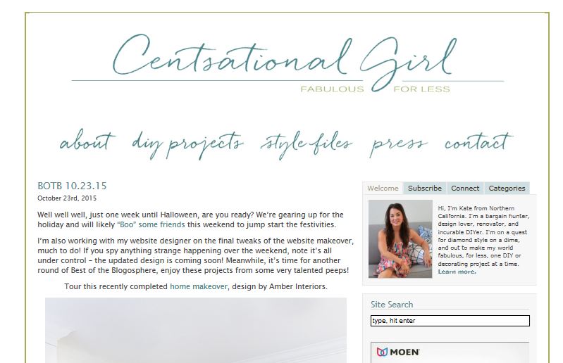
Six years ago I hired someone to build a WordPress blog for me and I was *still* operating on that outdated theme until yesterday. I was having all kinds of problems with it due to changes in code and SEO policies, also the old look was a bit of a plain Jane, remember?
When Google made their big announcement earlier this year that sites get penalized for not being mobile friendly (booo!) and after several readers inquired when it would happen, I decided over the summer to get busy on a site makeover. My first thought was, hey it can’t be that hard to just switch to a mobile friendly theme, right? Being a DIYer at heart I thought I could do it all myself.
I thought I could just buy one of those pretty themes with everything preset and install it, I paid $50 for one #becauseimcheap and set up a demo site to make all the changes and thought I could just import them. Cue that music in the movie when something bad is about to happen but the main character doesn’t see it yet. That resulted in crashing my server several times and sending my site offline for hours – I tried it over and over again with fingers crossed hoping for the best and generating even more problems, so I knew it was finally time to talk to professionals.
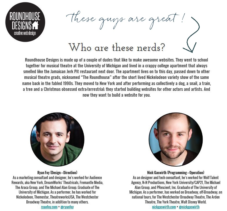
For some random reason, I stumbled across this lovely blog and this lovely blog in the same week and noticed they were both designed by the same team at Roundhouse Designs. I liked what I saw so I emailed them, explained my problem and in 24 hours they had me on the phone. I proposed a band aid fix. “Can’t you just install the cheap theme I bought?” They didn’t laugh at me. They should have but they didn’t. Maybe they did laugh when I wasn’t on the phone.
They should have laughed – they probably cried instead – because we learned all those band aids I’d been using for years on my old theme were causing plugins to compete with each other for attention thus causing my blog to “slowly implode from within”. Their words. That was not the description I wanted to hear about the blog I’ve been filling up with content for six years. Cue the music in the movie when the main character realizes it’s time for a change.
So we started from scratch and the guys at Roundhouse (Ryan and Nick) built me a brand new site with all the bells and whistles I needed to be modern and continue to deliver new content, and they imported all the old content from the old site.
You’ll notice we replicated much of what was already in place – I liked the basic layout so you’ll see similarities. But instead of all the hand coding I’d been doing for years, now there are simple buttons to click to make it all oh so purty and organized.
Thanks so much guys!
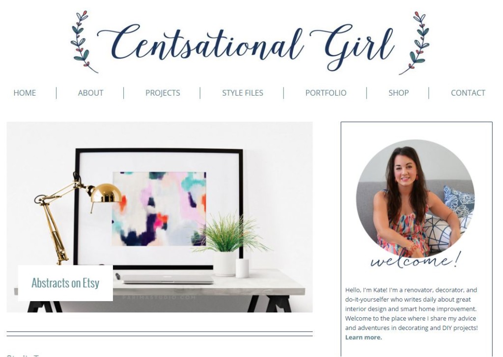
The priority was organized easy navigation. The guys installed a slider up at the top of the content that rotates the not-to-miss articles from the past month, just in case you haven’t visited in a while. I love that.
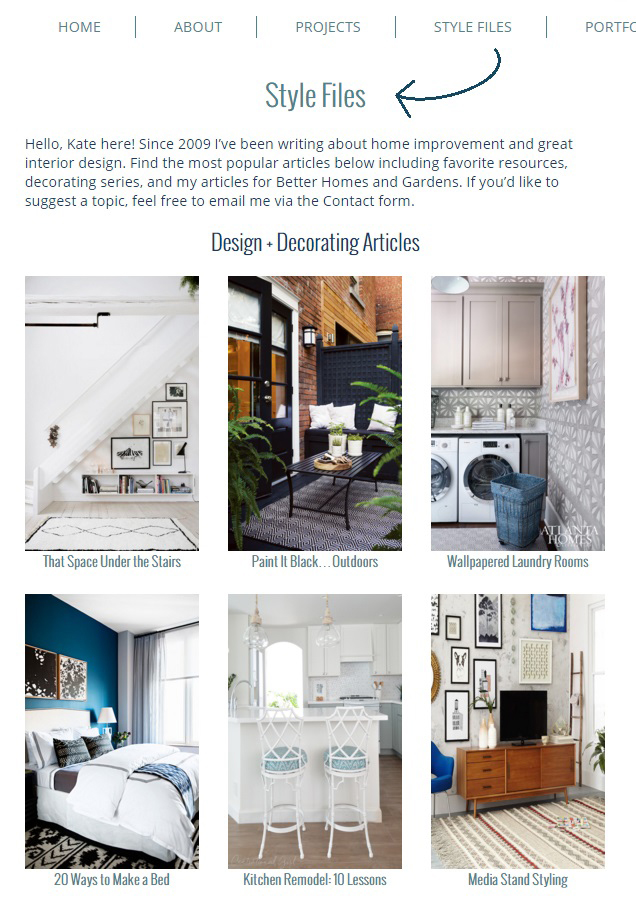
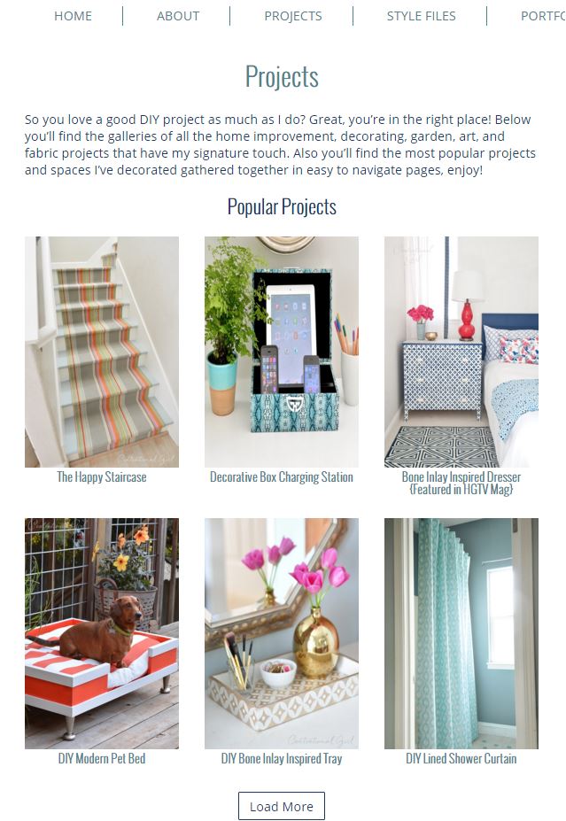
I like a site where it’s easy to find content, good navigation is a big deal for me. My content is split between decorating articles and DIY projects/space remodels and I wanted to make it easy for long time readers and new visitors to find it all, so just as before you’ll find all the best decorating articles and resources in one of the main categories, the STYLE FILES, easily found from the navigation bar.
You’ll also find all of my DIY projects and remodeled spaces on the PROJECTS page, again just like before.
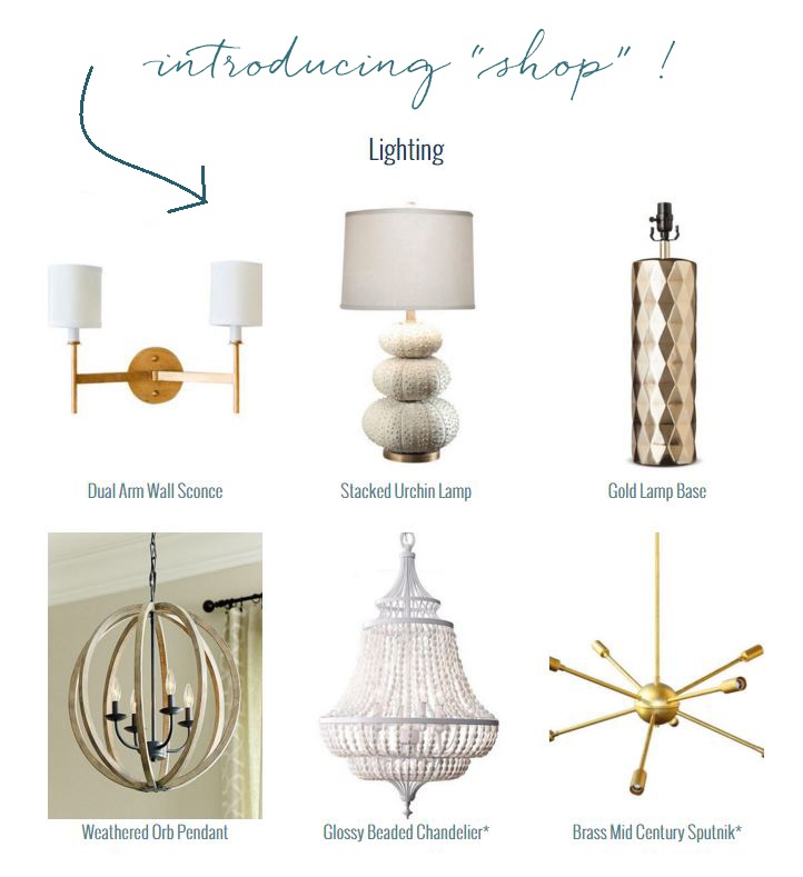
New to the blog is a page called SHOP dedicated to all the objects I love with categories for furniture, textiles, lighting, and accents. It’s here I share so many of the things I own or have used to decorate spaces, and other favorites too – I’ll be filling it with more finds in the weeks to come.
With any blog design there are a million choices to consider. The editorial look is used now by many magazines and large blogs and has grown in popularity but I wasn’t ready for that yet. Since it’s only me and I post 3-4 times a week it didn’t make sense to switch to an editorial layout, so I kept the basic “new content on the front page” blog design in place, plus I love when I can see the new content right away when I visit a blog, especially a personal one that’s not run by a huge team.
As for the color palette, I decorate with and wear a lot of navy, teal, and dark pink so those colors have been incorporated into the new design. The lovely logo is by Jamie at Fresh Lavender Designs, it’s feminine and fun script with a pretty botanical detail and a nice contrast to the sans serif fonts used throughout the galleries.
Once more, I give huge props to the guys at Roundhouse Designs, they were a great team to work with, eternally patient, wicked smart, and they have great personalities too. Fellow bloggers, if you’re looking for a design team, I highly recommend!
So we’ve cleaned out the cobwebs and swept all the dust out from under the rug that existed on the old site. It took hundreds of hours to categorize and organize everything, and there are still a few details that remain. It’s a brand new day with the brand new site! Hop on over to the blog if you’re reading via email or RSS subscription to see the clean and contemporary look, hope you like it!
More good stuff happening this week including pictures of the studio… be back soon!
…


The new design is so fresh and lovely Kate! I love the colour palette – how perfectly it works with your bio photo – and the new logo is so pretty. Congrats on the move.
Kate, it looks great! Congrats on the updated site!
Hi Kate – looks great! I love the clean, simple, but organized look! Would you be willing to share what you paid to have Roundhouse overhaul and redesign your custom wordpress site?
Thanks,
Kara
Each site quote is different Kara, I’d encourage you to send them an email for a quote!
I love the new look!
Looks great! Where will the
“Good Reads” be located?
I’ll be adding my blog roll Lisa thanks for the reminder!
Looks great! Probably explains why the site wouldn’t load for me at all last week. However, I think there may be still some glitches because in my bloglovin’ feed it shows all of those items you have listed in the SHOP page as individual posts.
Well that’s annoying Rachael! Gah! Didn’t see they were coming through the feed, ugh. So sorry about that – I’ll tweak whatever is necessary so those Shop posts don’t pop up in the feed. :(
We are already on it! :)
It looks GREAT. So fresh and pretty. Congratulations!! :)
Love the new look! I understand the aches and pains of having to rebuild your site. I went through the same process this year, after 9 years on the same platform. It took me a year to re-built my site (with some professional help), however, finally launched, all shiny and new as of 1/1/15 and it was worth it!
Congrats!
I love the refreshing new look! I also love that everything is easy to find. So many times I come back to your site to search for something I saw you do years ago. This will make it so much easier. Thanks!
Hooray! It’s fabulous, I love it!! Totally fresh and makes me cry when I look at mine :)
Loved your story about doing it yourself, too funny!
xoxo
Maria
Smashing!
Looks lovely. One thing: when reading on my kindle I can’t enlarge the page by “spreading” it with my fingers. Is this by design?
Cheers!
Hallie, I can’t enlarge on my iPad either. I hope there is a way to restore this functionality because CG is one of my favorite blogs – but I just cannot read the tiny text. The header graphic is lovely, though!
All fixed Lisa !
It looks fantastic, Kate!! I know what a chore that must have been (because I’ve been putting it off for YEARS), but how great it must feel to have it done!!!! xoxo
Hi Kate! It looks fantastic. I love your new ‘home’. Congratulations! xo
Looks great!
It looks so clean and fresh Kate! I so need to update my site. I am so not techy, but an hesitant to spend the money but it is probably worth it. I screw up even the smallest coding task on my site. You have inspired me to make the change! xo
The new design is beautiful! Thank you for all you do to continue to bring fresh content. I have been reading every post for years now!
Totally love it! Looks so so pretty. I have to get some stuff done on mine too.
So bright and fresh! I really love it, it’s new but still “You”.
Looks great! Love the bolder font too. Makes reading much easier. Congratulations!
I’m so glad you are back. The site looks great!
Hi Kate. Such a fresh and lovely design. I love the watercolor flowers on either side of your name. Did you paint them?
Longtime reader and big fan of yours who just wanted to add my congrats on the website refresh. Love the typography, organization, and color scheme. Most of all, love your work and the inspiration it provides.
Love the new design. Everything is so well organized and easy to find what you are looking for. I know how hard a redesign is. Great job.
The new site looks great! I guess that old adage is true, isn’t it? You get what you pay for! Well done to you and your team!
So glad your site is updated. I had to stop visiting for so long because my pc would be angry any time i tried. Now that you are mobile friendly i can read on the go. Funny isnt it how other companies can drag us kicking and screaming into the future. We had to update by husbands website for some of the same reasons. and hey you now you can use it as a teachable for your kids…when its time to hire the pros
So I tried to follow the link (in the last paragraph) to Roundhouse, and it took me to actionplumbing.net. I’m guessing that wasn’t intentional. :)
I love your new site!!! Explain what an “editorial site” is!?
I actually meant to say editorial look….
Hello Gray, it’s a different layout almost like a grid where there are thumbnail images and you can click on them to read the articles. Two examples:
http://www.ruemag.com/
http://www.bhg.com/
Kate
Looking good ?
Love it, it definitely represents you and your style, love the color scheme. Your logo looks great as well :) That’s pretty neat what they did with the project & style files!! Love the shop detail to. Great work!!! So happy for you.
Lauren Baxter | Lovely Decor
xx
Your old Web site was so cute but you’re new one is A-M-A-Z-I-N-G! It’s so fresh and the font, colors and use of space are so you! Love it!
I am having a problem looking at the archives oldest posts to newest ( which I was doing before the redesign). If you are using the page numbers at the bottom of the website to move through older posts, everything page 121 and higher is coming up as page not found. Please, please, please can this be fixed?
Okay I’ll take a look Sara, thanks for letting me know!
Hi Kate! Sorry to be a pain but do you know if this issue will be fixed? If not, is there another way to read archives chronologically? Thanks for your work.
I am a total idiot and just found the older and newer buttons moved to the bottom of the individual posts. Ignore the idiot in the room!