Courtney Lake and I met years ago via the internet over a trellis wall and we’ve been friends and cohorts in decorating ever since. We both live in the Bay Area, him to the east, me to the north, and we’ve met up over the years at various events.
Courtney and I both agree with the “not everything should match” philosophy of interior design, in fact, efforts should be made to not match, but instead to complement. Spaces should feel collected over time and the phrase “it doesn’t match” is a welcome one in our world. Please welcome back Courtney as he explains his rules for mixing pattern in interior design.
“I often hear this phrase uttered when working with clients “I would have never thought to put those two things together…” I like to think this is because I am a design savant that has impeccable style and taste. Truth is, it is because I adhere to some basic rules for mixing patterns and fabrics to create interesting combinations which Kate asked me to share with you so let’s dive right in with the first rule…
1) Build On Your Existing Canvas Unless you are starting a room from scratch, then look to your walls for inspiration when selecting fabric. If your walls are beige, then at last two of your fabrics should have an element of beige in them. Typically a room’s walls are the largest expanse of color (yes beige is a color) in a space and by tying in the room’s largest element to your fabrics, you instantly are creating a sense of harmony and balance in the space.
Steven Gambrel
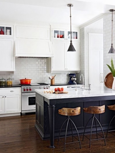
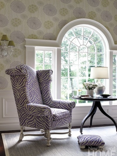
2) Pattern Is Everywhere. Take a moment and look around your surroundings. From wallpaper and wainscoting on the walls to the floorboards and carpets, pattern is everywhere so uses it to your advantage. Take cues from the room to help determine which patterns may work. Have a stained glass window in your living room? Why not use damask on a chair? If your you fireplace has mosaic tile, then you may want to avoid putting a busy pattern next to it. Your room will give you visual notes on how to decorate it, so pay attention.

Country Living; Jonathan Adler
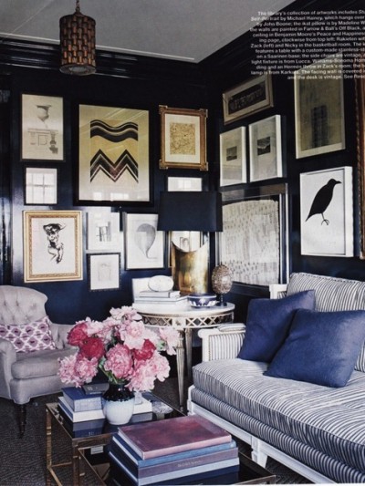
3) Odd Numbers For Pattern Success. Some rules of design reappear over and over simply because they work. The “Rule of Three” is one of those rules which states design elements look best when paired in three or odd numbers. Applying this rule to pattern here is how I break it down:
Pattern 1: This pattern is your ringleader – it sets the tone for the remainder of fabrics you select. This pattern should be big, bold and have more than two colors, which is key in helping you pull colors for subsequent fabric choices. For this fabric, I like to use an abstract floral, Ikat, or even an oversized plaid.
Katie Rosenfeld
Pattern 2: The second pattern should be about ½ the scale of the first pattern. For this selection, I like geometric or re-imagined animal prints. At this point, it is okay to use a fabric (and I encourage it) to use a fabric that has a more restricted color palette. It helps ensure that you are not fighting the other patterns in the mix.
Pattern 3: The last pattern can be a subtle version of the first two. Personally, I gravitate towards a tone-on-tone pattern or a textured velvet (hello burn out). These act as a solid and give me the opportunity to sprinkle them throughout the room.
Which brings me to my next rule…
4) Stick & Move. Pick one or two of those patterns and sprinkle it throughout the room. Place Pattern 3 in a chair in the form of a pillow or make Pattern 2 into a lamp shade and use it in the hallway. Avoid sticking all your hard work in a corner or on the sofa to ensure the room looks cohesive and flows.
5) Choose One Family. Simply put, don’t mix jewel tones with primary colors or muted pastels with citrus hues because it will make all your hard work look like a hot mess. Color tones are typically grouped into hues or “families” – if you ever read the 1970’s book Color Me Beautiful you know where I am coming from. Analogous colors that are neighbors on the color wheel are easy to mix together, like Phoebe’s inspired mix of pink and orange.
6) Opposite’s Attract. So I just said in Rule 4 that it is best to stick to colors in the same hue family, which is true, but if you want to be adventurous, look across the color wheel for a match or coordinating color on the opposite side. It is a reason why blue and orange look good together as complementary colors, or blue and deep red with touches of yellow (split complements).
7) Formal vs. Informal Patterns. Ever put together a couple of pillows and was instantly struck that it appeared juvenile or best suited for a nursery? Just like clothing, different fabrics and patterns have different levels of formality. I tend to think of fabrics on a range with duck cloth/denim being the most informal to velvets and silks being the most formal.
Factoring in the formality of the fabric ensures your pillows, curtains and upholstered pieces don’t run in stark contrast to the overall personality of the room. An easy question to ask to determine if a pattern is informal or formal is “Would you wear this pattern to a fancy dinner?” If you say no, then the pattern should be considered informal and vice versa.
8) Mix Fabrics Textures. Fabric weight plays a huge role in how patterns look when grouped. A cotton sateen can look cheap when put against a silk pillow or a mohair chair can look dowdy when paired with a sheepskin throw. One of my foolproof trios of fabrics is velvet+linen+silk = fabulous. The visual weight of lux velvet against the rough texture of linen combined with the silk’s sheen works well together. At a lower price point, I love mixing duck cloth (denim) with burlap and ultrasuede. Again it’s the same general thought – visual weight with rough and refined.
Follow these rules and you can mix with abandon like your favorite designer. Be bold, be daring, and most of all have fun! Remember, it is only fabric!


Thanks so much Courtney as always for your monthly visits, very insightful for those learning to mix patterns and avoid the matchy-matchy look! You can catch up with Courtney’s daily adventures in design as his blog Courtney Out Loud, and if you’re local, hire him to makeover your space!


A big thanks to Courtney for an amazing post! I always have trouble pulling it all together and this has so much useful information. Thank you so much!
Thanks for giving us these tips..they are really helpful. All these round up of inspirational photos are phenomenal :)
I really love mixing patterns and colors. I think Courtney has provided some great tips in this post. I think you really need to start playing around with fabrics and patterns to see what works and what is a little “off” that will help a person who feels a little lost get more comfortable with mixing.
Looks like you’ve got two number 2’s! Great post with great info and lovely pictures :)
This was an incredibly useful post – thank you!
These tips are great! I’m wanting to change out some fabrics in my den and I think I’m going to print this out and take it with me to the fabric store. I had to laugh at the Color Me Beautiful mention! I so remember my mom having this book when I was little!
when we bought our house 5 years ago, i knew NOTHING about decorating & i though everything had to be matchy matchy. well, i’ve come full circle & now i realize how great it is to throw different things/pieces/textures,etc. together. i’m having a lot of fun with this & our house is finally getting to the point in which i am very happy with it!
I am so clueless with patterns and tend to be a matchy matchy person. Thank you for this post! Definitely pinning for future reference!
Super helpful tips and now I have homework, lol. I now need to 1. paint my walls a different color and 2. get rid of my busy rug near my mosaic fireplace. :)
Great advice, Courtney, especially about how to mix patterns! I struggle with that so much, but when you see it done right it looks so effortless!
I’ve never read such a thorough, concise, and accurate treatment of decorating advice. You’ve hit so many nails on the head, I can’t count them all!
You’ve done it again. Why am I surprised?
Oh, and I thought that I was the only one who STILL thought that Color Me Beautiful was relevant. It’s a classic I still live by.
I admit to having no clue on how to decorate. My current house is a bit “matchy”, which is no doubt why I don’t like it. Thanks for these tips!
I agree…not everything should match, but to complement. These designs look great! I like the choices of colors. They compliment each other.
Thank you for this. I have such a hard time with color and patterns. This advice is getting bookmarked.