I’ve had my head wrapped up in ideas for my fabrics for the past few days and then realized some of you asked about pattern mixing in the comments on my youngest daughter’s room (see it here). One question was how to go about mixing patterns successfully and Michelle offered up a few really great tips last week.
My approach to effectively use multiple patterns in a room is to start with one pattern that will dictate the palette and go from there. I pick a patterned fabric I love (or sometimes rugs or wallpaper or artwork) and use that as a jumping off point for the additional colors and patterns that will be included in the space. Here are some examples of the technique in some beautiful designer spaces and then a quick example of my own.
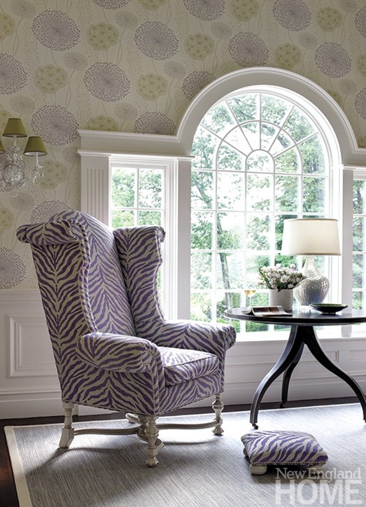
This wallpaper in this sitting room sets a lavender and green palette with the lampshades playing off the green and the purple zebra mimicking the hue found in the flower pattern above.
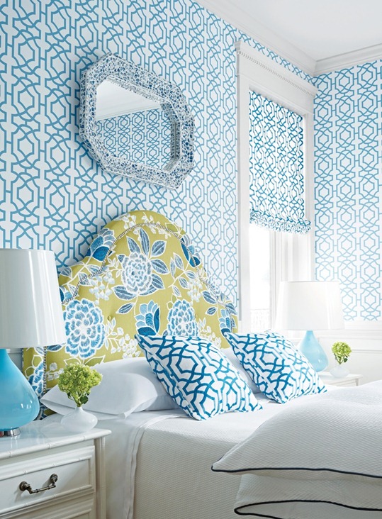
Two colors next to each other on the color wheel will work together, below is a beautiful medley of bold green and blue in a floral paired with geometric print wallpaper and accent pillows, that print taking its color cue from the botanical. Mixing florals with geometrics is a win win combination!
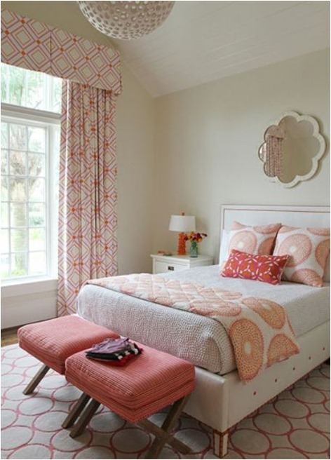
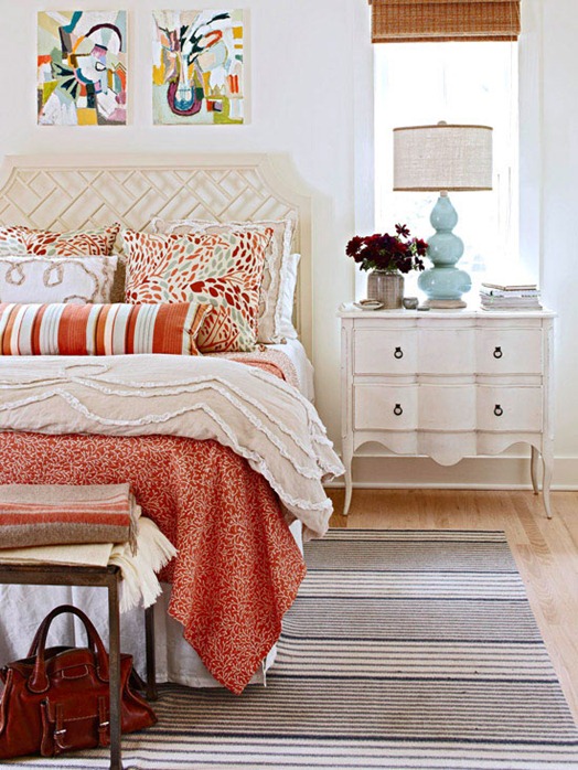
A bedroom by Andrew Howard combines pinks and oranges in multiple geometric patterns, varying the scale of the prints but sticking to those neighboring hues on the color wheel.
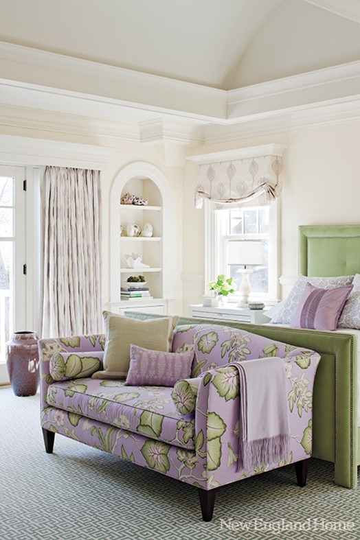
Choosing one large scale dominant print such as the lavender and green botanical on the sofa below creates a jumping off point for other choices in the room. Notice a softer lilac print in the window panels and bedding and yet another lavender small scale motif next to a green solid on the sofa.
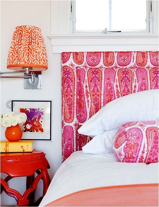
A bright paisley in pink and orange sets the palette in this vibrant bedroom, with a smaller scale zebra-ish print appearing on the lampshade and another bold version of a hue in the headboard present on the nightstand.
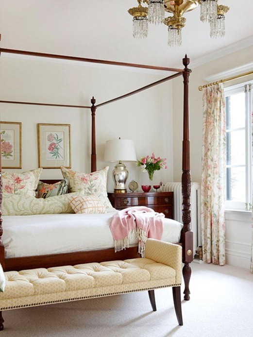
Your palette doesn’t need to be bold if your fabric is not. Use the same technique when decorating with softer tones or traditional fabrics. The pale pastels that appear in the large scale floral on the window panels are present in smaller scale fabrics on the bed and tufted bench.
Here’s a basic example I created of how to use a pattern found in fabric to dictate an entire room’s palette and pattern choices. 1. Start with the beautiful watercolor floral as your jumping off point. Notice that gray is a neutral that is present so it can be repeated in the form of 2. grasscloth wallpaper or 3. a greek key print rug on the floor. 4. Use the gray yet again in a smaller scale geometric motif (window panels, pillows, etc.). 5. Pull out the apple green found in the floral and use it as a bright color on an accent chair or bench or settee and again on a smaller scale somewhere else in the room such as a lampshade or ottoman. 6. Paint one piece of furniture a bold deep blue (or the walls). 7. Accessorize with any other modern prints that live in that same blue and green palette introduced by the floral. Throw in some wood and metallic tones and personal or unexpected accessories too.
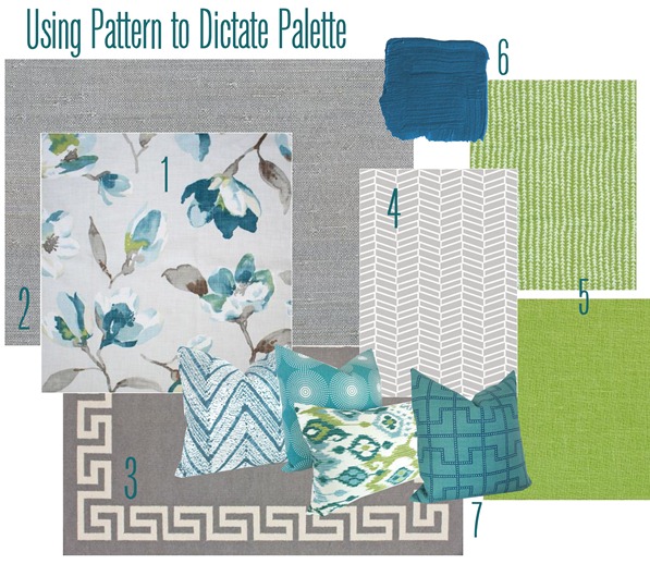
floral – grasscloth – rug – herringbone – small scale green - green linen – pillows
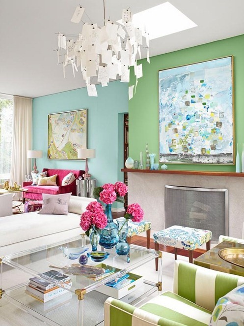
The same concept is true for artwork, Sarah Richardson pulls blues and greens and pinks out of the two pieces of abstract art in these seating areas in her home, working with fabrics in bold stripes, botanicals, and solids.
Both fabric and art work together to dictate a bedroom’s fabric and accessory choices below. Notice those Pine Cone Hill pillows have shades of apricot, deep orange, and pale aqua blue. Mixed into this space are two different stripes in blues and oranges on the rug and bolster pillow, and a quilt in a smaller scale coral motif, all in the same palette present in the artwork and decorative pillow fabric.
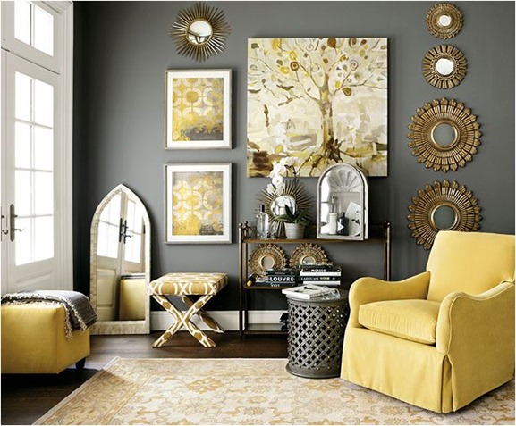
Area rugs are yet another tool for deciding what colors or patterns to include in a space, yellow and gray dominating the motif of the rug in this living room, and the same hues reappearing in the fabrics, artwork, and wall color.
So the long answer to those questions is this technique mentioned – it’s always my first instinct when I go about pulling a room together. I look to a pattern found in fabric, art, or a great rug to inspire the room’s entire palette and many of the accessory choices in it. Hopefully these examples above help to illustrate!
.



Love all the examples!
thanks for this Kate…you do such a great job of breaking down the magic of design into simple yet meaningful rules. I must say of all the pictures here, my favorite is the board you created around the blue and grey watercolor fabric. delish!
Kate, I’d say you’ve mastered pattern mixing and color palettes! :)
I love this! I just recently got brave enough to start mixing patterns and color palletes. I’m still experimenting, but it can look awesome if done correctly! :)
Genius. And all along I thought you were winging it :)
I’ll be saving this one for the next time I do a refresh or a redo here at home.
Great post!!!
Thanks for letting us in on your “secret”! I’m working on my bedroom right now, and these tips are so helpful for pointing me in the right direction!
~Abby =)
Thanks for sharing the science of pattern mixing! These are all great tips and beautiful examples.
Soooo envious of your talent for color & design, Kate! I always look forward to your next post in my reader.
Q for you: in your mood board example, you used the neutral for walls, floor and windows, do you typically stick with that formula? Anything that can help this design coordinating illiterate do some decorating on her own is appreciated!
Thanks for sharing!
Great article and absolutely love the colors in the mood board. What is that bold blue paint color called. Swoon!
Hi Kate! Just wanted to drop a quick line to say THANK YOU for always posting great articles on the use of color and patterns. I’m a cookie decorator and get an incredible amount of inspiration from your blog. This post in particular was very helpful as I’m not always great at mixing patterns. Thank you so much! Christine – Sugar Cravings
Mixing colors and patterns is tricky business. Even the pros can overwork it. Love your wonderful breakdown of how to do it right. This post is a ‘saver’ for me!
Wow, wallpaper has come a LONG way! I would actually consider wallpaper to add some real texture and color – these patterns are all amazing!
I LOVE this post!! It’s fascinating how you can make a muted palette come alive with subtle patterns and other colors within the palette. Decorating is an endless possibilities. That’s why I love it!
Hi Kate, I just did a post on this subject. I am a new blogger so I have a lot to learn about the writing process. Your examples really helped readers to visualize your point. Great post!
I am SO AFRAID of mixing patterns. I LOVE the look, but just feel inept. This was a good inspiration post for me. Thanks!
I had the same question as Lisa E. on that gorgeous blue paint? Its looks like the peacock blue you had used on the little console earlier which was beautiful. All you do is stunning and I so appreciate blogs like yours. You are one Centsational Girl (pun intended).
Many thanks
Hi Debbie, I don’t know the color but it looks close to that Peacock Blue on the chest right? I used “Fiji” by Benjamin Moore Affinity once and it was really close to that color too!
This is such a great post and a great topic! I’m putting this one away in the ‘design files’ for sure.
Thank you!!
Susan
simplymodernhome.com
Amazing examples! And thanks for this new design perspective. I’ve never tried creating a palette based on the best pattern in a room and so I don’t have much idea how beautiful the results can get.
So the one constant I see from these examples that when using multiple patterns in a room is to use plenty, and I mean plenty, of white!
I am totally obsessed with the wall paper in the first photo. Did the original source list the brand? I have been digging around on New England Home, but can’t find that photo anywhere.