In addition to my own remodel projects, I started offering design consulting last year. I received an email from Kassie who found me through the blog, it turned out she lives in my hometown and she was wondering if I could help her with her kitchen.
Our first meeting took place in November in her 1980s kitchen, Kassie and her husband David hated it so much and wanted to transform their U shaped kitchen space into one where they could cook and entertain and they were anxious to get started.
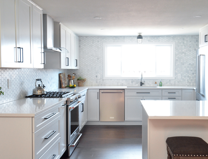
Kassie wanted a look that was light and bright and modern and with patience and planning, she got what she wanted! The remodel took six months and I’m so happy to be sharing the final result with you today.

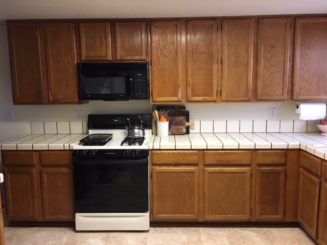
Here’s a glimpse of the range side of the kitchen, before and after. Note the dated oak cabinets and tile countertops that were way overdue for an update! It’s such a striking difference!
The first thing they tackled after demolition was installing the new flooring. Kassie and David went back on forth on various options but finally decided on vinyl plank product in a deep wood tone that grounds the space especially with all the white surfaces, wise choice!

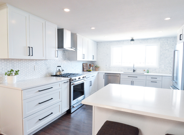
Kassie and David worked with Home Depot’s kitchen cabinet designer and placed an order for Kraftmaid shaker cabinets in White Dove and white quartz countertops.
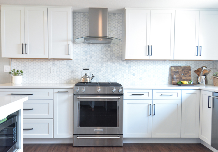
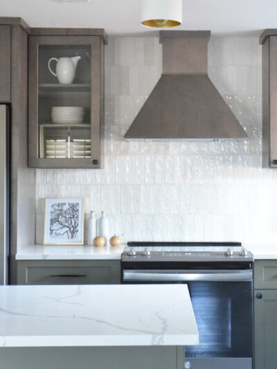
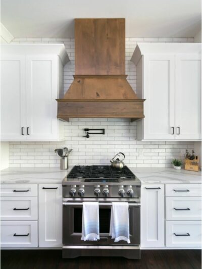
If you scroll back to the before image you’ll notice the kitchen range was off center. It was too close to the kitchen entry which was awkward for anyone cooking and aesthetically off balance. I suggested as part of their new cabinet plan that they center the range on the wall. It required having a plumber move the gas line over a foot, but it was worth it to center the range to give the chef more personal space and to make this wall more visually pleasing.
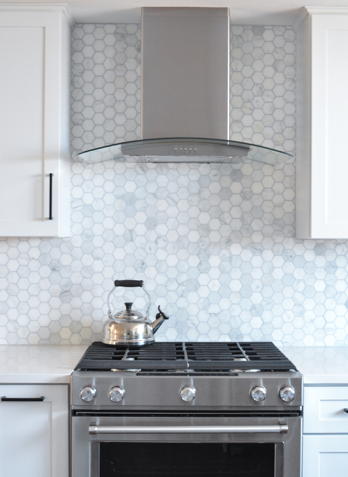
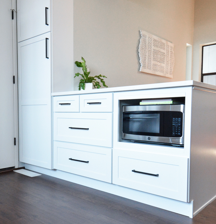
Kassie & David chose a streamlined stainless steel hood with curvature. It’s always a good idea to introduce rounder shapes whenever possible in a space where everything else is angular. This range hood is visually less bulky because of its tempered glass. Note they moved the microwave over to the peninsula (seen below) where it’s hidden inside a cabinet.
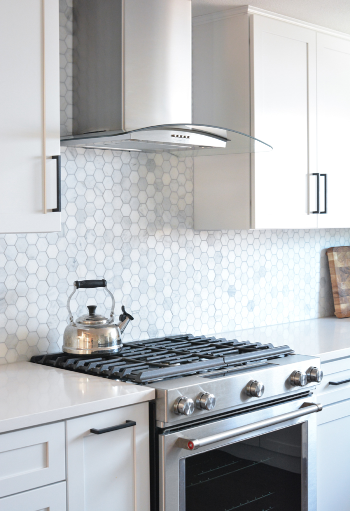
I’m a huge advocate for slide in ranges instead of freestanding ones because the back of the range follows the line of the countertops and shows off more of the tile, they’re more expensive but totally worth it for that reason.
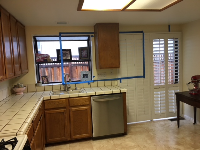
Here’s an image of the kitchen’s window wall before the remodel, note the placement of the sink under the garden window and the dishwasher to the right. I recommended they get rid of the rarely used slider since there is access to side yard through the adjacent garage (and full access to the rear yard through the family room). I suggested they reframe the wall with a window that was centered, larger, wider, and rectangular to bring in more light and also symmetrical on the wall. Then center the sink and flip the dishwasher over to the other side.
After our meeting, Kassie sent me this picture with the painter’s tape suggesting where a new window would be in the new kitchen. Yep, exactly!
Reframing a new window meant removing the odd upper cabinet and sliding door and completely reframing the wall but they were totally on board and they did it and the difference is amazing!!
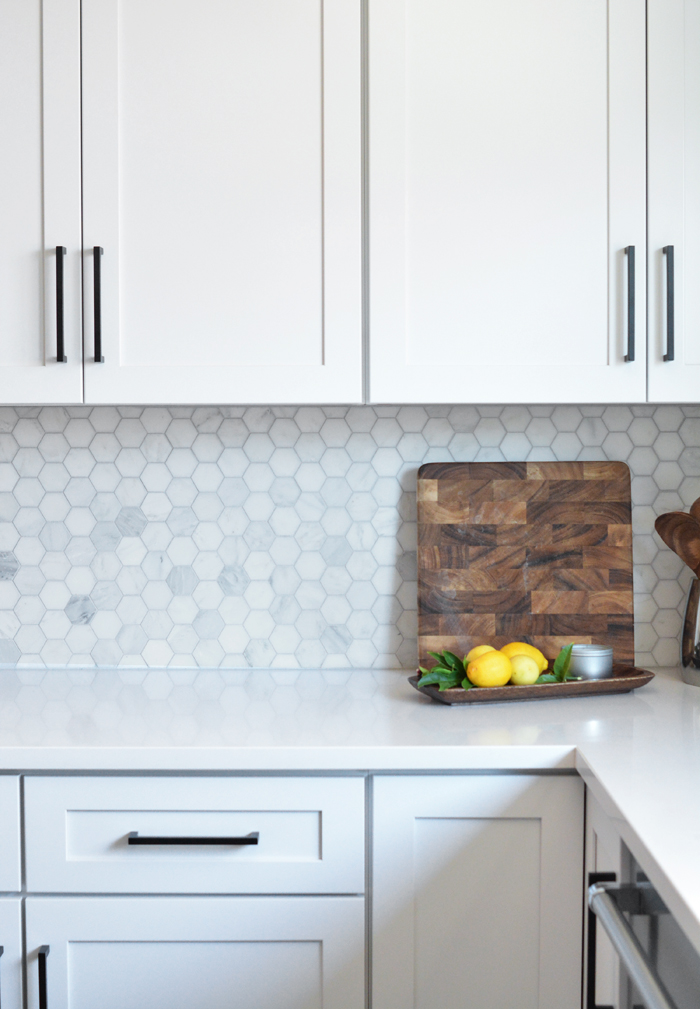
I’m a firm believer in installing tile to the ceiling whenever it makes sense, which it absolutely did here.
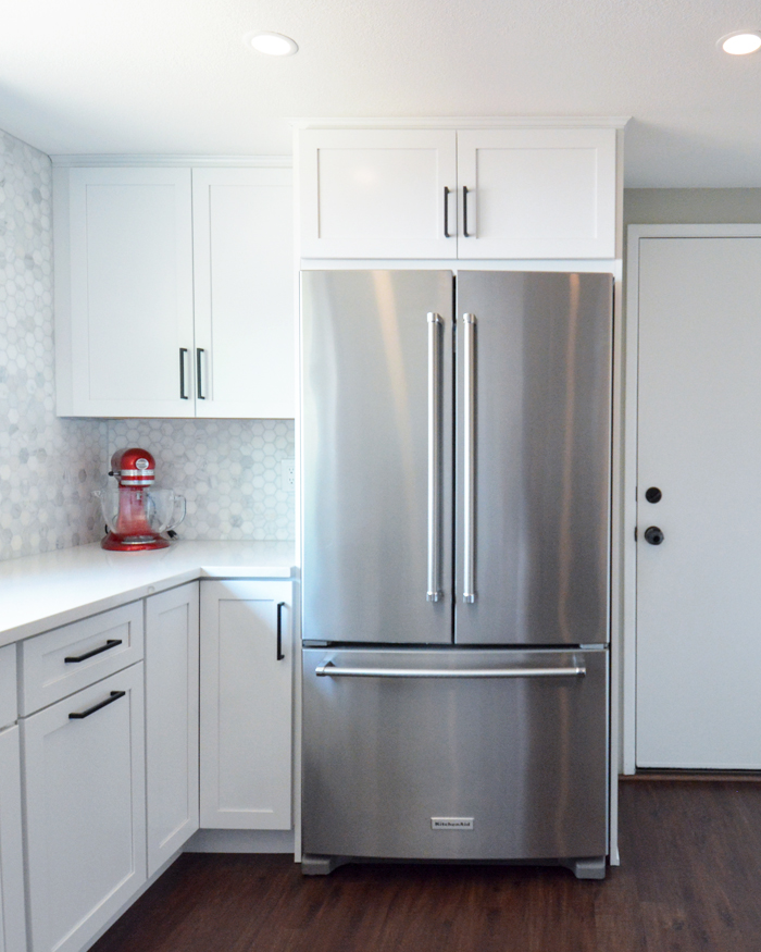
In the original kitchen, the refrigerator sat next to the pantry and visually blocked the kitchen space from the dining room, you can see a peek of it next to the pantry in the image below. I recommended the fridge be moved to the blank wall and framed in, an idea they had also thought of as better placement for the refrigerator.
![]()
Kassie and David opted for a more shallow counter depth model and framed it in so that it created a mini corridor when entering the kitchen. Amazing difference, right?
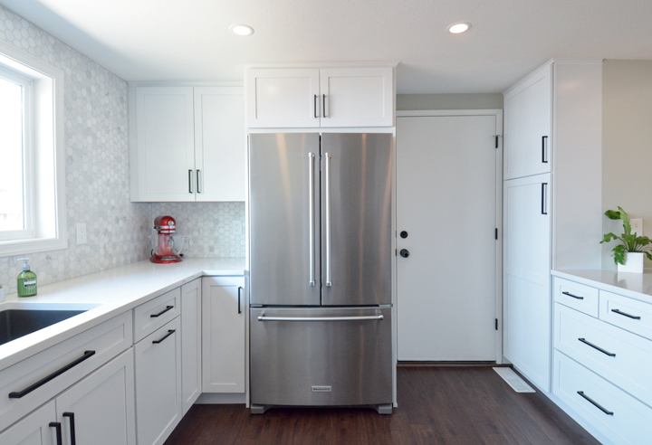
Wherever you place a refrigerator, there always needs to be clearance for the doors to fully swing open, something to pay attention to with any cabinet design plan. In this kitchen there is plenty of clearance on both sides.
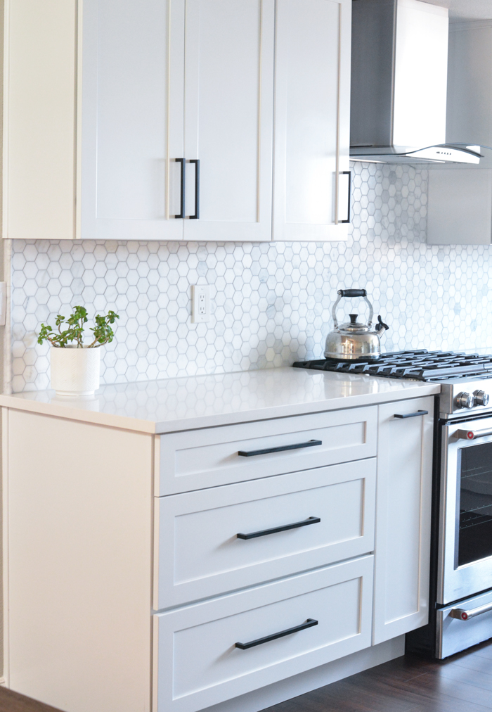
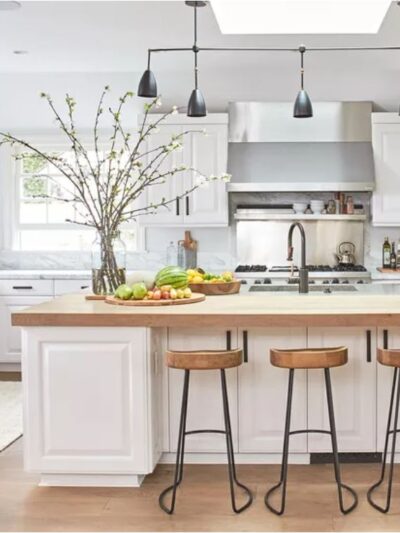
With the refrigerator moved, there was room for a nice peninsula that looks out to the adjacent dining space. The large quartz countertop provides room for two people to sit comfortably on a stool on the other side and it also hides the microwave.
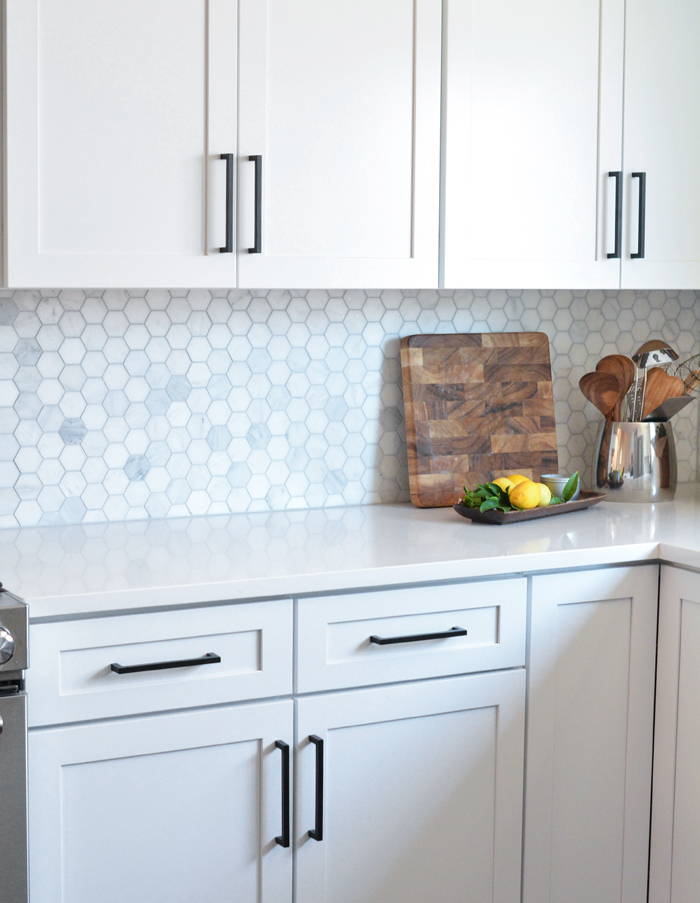
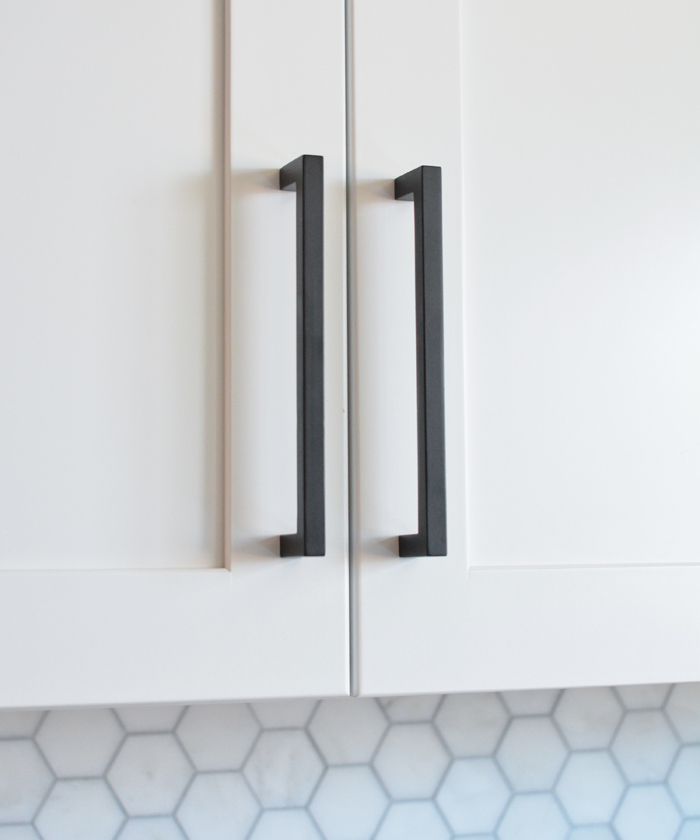
Because the cabinets and countertops were white, I recommended they add small doses of black to their kitchen with a black light fixture above the sink and matte black pulls. Both add the perfect amount of contrast.
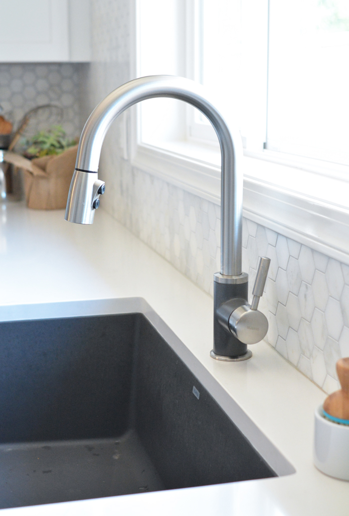
They surprised me by adding yet another element of dark contrast, the dark granite sink. In the beginning, they had planned on keeping their original stainless sink but swapped it for this granite version instead, fantastic choice! Don’t you love this two tone single hole faucet, that touch of cinder gray perfectly matches the sink.
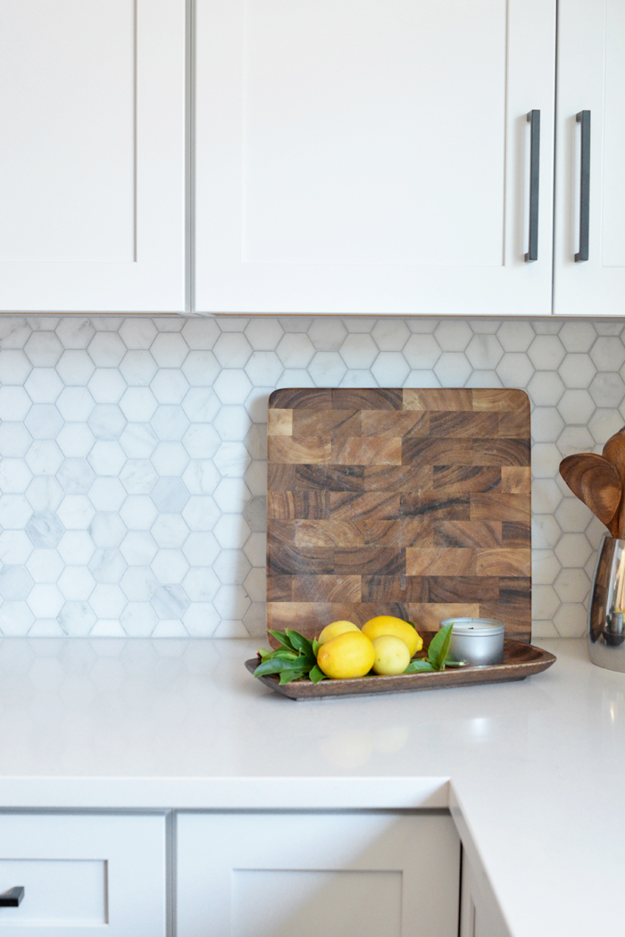
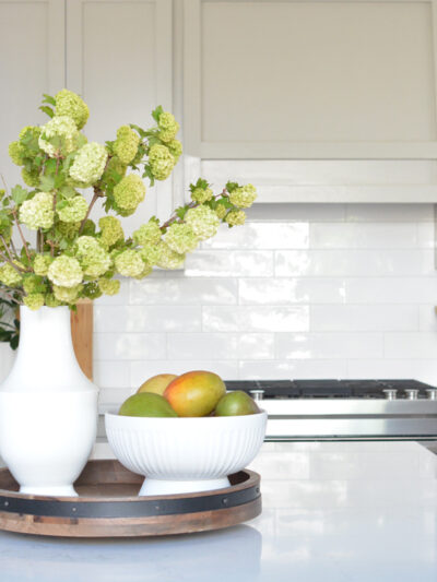
Kassie had her heart set on hexagon marble backsplash so I said girl, go for it! Marble hexagons are classic and the smaller scale is just right for a backsplash in a kitchen of this size.
For lighting, they substituted six 4” recessed lights where the old florescent box used to be, the smaller size recessed light is a better choice with a lower ceiling.
I was so impressed to learn that David and David’s brother did most of the work themselves! With patience and great attention to detail, they installed the flooring and the cabinets! They hired countertop fabricators, and also help to install the backsplash but the rest of the work was DIY – amazing!
Congratulations Kassie and David on your light, bright, and modern kitchen renovation!
Thanks so much for hiring me as your design consultant, it was a pleasure working with you!
For those in Northern California, I now offer kitchen and bathroom design consulting services, see my portfolio page for how to arrange an introductory meeting.
kitchen sources:
cabinets: KraftMaid Shaker in Dove White / countertops: Silestone in Eternal Statuario
flooring: Cortec in smoked rusted pine / refrigerator: Kitchen Aid counter depth
dishwasher: Kitchen Aid in stainless steel / range: Kitchen Aid slide in range
backsplash: honed hexagon carrara / hardware: TobKnobs Noveau III in Flat Black
sink: Blanco granite undermount in cinder / faucet: Blanco Sonoma in stainless + cinder
range hood: Whirlpool concave in stainless / sink light: Hudson Valley Hailey semi flush mount
.


So beautiful and what a transformation! Classic style that will be a joy to cook in for years to come. I am very impressed with their DIY skills.
In my mind, three big things made the difference (besides the finish choices): centering the oven, the large window centered over the sink and moving the refrigerator. Congrats on a beautiful design!
Lovely! Moving the range to center was certainly key, and the new window is lovely. Only negabtive for me is not being able to get outsider right from the kitchen. We eat 3 meals a day outside in the New England Summer (from May-September) and could not live with out direct kitchen access! Having to go out to garage and then outside would not work for day to day meals on the deck!
I hear your concern Monica but note there is full access to the rear yard and backyard entertaining areas through the family room which is right next to the kitchen. :) The slider that was removed was unused, and just an additional access to the side yard, which is also accessible through the garage.
LOVE this! Saving for inspiration – we are beginning a long, drawn out renovation on our 80’s era house and this is exactly the feeling I want in the kitchen! Most of all I love the tile, and need to be able to show the hubs what it would look like.
It’s a classic space, thank you so much!
Amazing!!
This turned out so beautifully!! Great job, Kate!!
This is a very pretty renovation, and should be published in a magazine! Well done.
Thank you for sharing all of the resources.
thank you so much that’s quite a compliment!
Kate, Glad to hear you are offering your talented services. Exquisite!
Beautiful design Kate and so great that they were able to DIY much of it themselves!
You’ve really transformed this room into something special! It is nice to see the process unfolding and there is something here that we can all be inspired by.
Really love the clean white look of the tile, it goes very nicely with the wood floors. Great work!
I love the black cabinet pulls. What sizes did you use?
Your kitchen inspires me!