Summer is in full swing, can you feel it? I can, this week especially. July’s days are drifting into one another as we sleep in a little bit extra in the morning, and spend afternoons sipping lemonade out by the local pool for an hour or two. I love all the kids in their bright swimsuits and towels and the moms in their swimwear in shades of turquoise, coral, orange, and pink. Summer is the season for wearing and decorating with the brightest hues!
I invited Shannon from AKA Design to share her thoughts on summer color, or “colour” as our Canadian friends say up north! Please welcome back Shannon.
“Hi everyone, it’s Shannon back again to talk summer colour! Summer is the perfect time to lighten up and have a little fun – with the colours inside and outside your home! Whether you spend your summer days soaking up the sun by the beach or keeping cool in an air-conditioned office, your home can give you that little extra bit of summer lovin’ when you dress it up for the season.
I’m not talking about gutting and redecorating an entire room just for the summer. What I really mean is changing up the accessories for the season; the throw pillows, the vases and maybe even the artwork. Of course if you are blessed enough to have outdoor spaces to call your own, you can take your decorating a step further by having summer furniture, throw pillows and colourful outdoor tableware too.
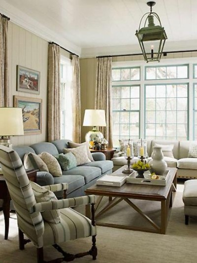
Blue is most often cool in hue; perfect for spaces that you want to be calm or sedate. It’s the colour of the sky, the ocean and twilight and commonly associated with clarity, creativity, and summer! It is extremely relaxing to settle into a space filled with blue accents after a hot day out in the sun.
Sources: Vogue, Restoration Hardware, Mary McDonald


Yellow is warmer than blue but it is famously sunny and bright. Yellow is cheerful and stimulates the mind, it is also known to spark creativity. Too much yellow can cause eye strain because of its saturated hue and the amount of light it reflects, but it is perfect for smaller shots of colour or outdoors in shady areas. Yellow is perfect for drawing attention to certain features, such as an accent wall or a piece of artwork.
via House Beautiful, Tracy Murdock, Better Homes & Gardens
Reds are stimulants and shades of red are commonly associated with passion and love. Red is another attention grabbing colour, making it perfect for accents in a space, especially one that gets used often in the evening, bringing coziness and colour as fresh as ripe summer strawberries and cherries.
source: Pottery Barn, House Beautiful, Better Homes & Gardens
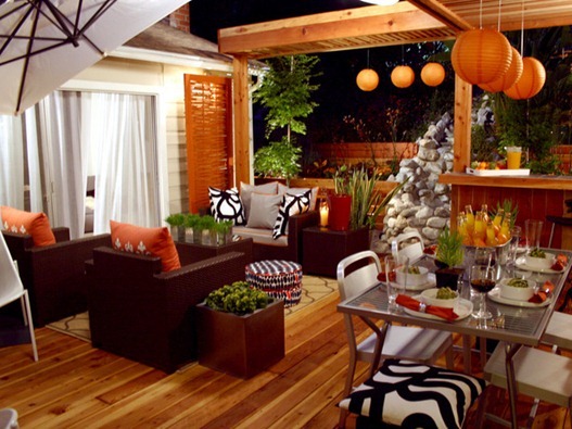
Orange tends to be loved or hated; most people have strong feelings one way or the other about it. It is typically the colour of autumn, but oranges like tangerine and peach can signify great fun in the summer months as well. It is simultaneously the colour of warmth and brilliance.
sources: DIY Network, Better Homes & Gardens, Seasonal Living
Green is second only to blue as a favourite colour and is also incredibly relaxing both mentally and physically – it is often associated with tranquility. If you seek a space that feels natural, organic, and restful, then green is the colour for you. Green makes for a brilliant splash of colour in its more vibrant hues such as lime green or Kelly green, but it is just as pleasing in softer shades.
Sources: Houzz, Camilla Molders Design, Southern Living, Home Design Decorating
Pinks are closely related to red and share much of the same characteristics without being as vivid for those that like some feminine flair. Pink ranges in intensity from hot fushia pink to the pale pastels. Used in an overall colour scheme, the summer factor can be punched up by adding fresh summer flowers or throwing in another accent colour like turquoise, yellow, or green.
sources: Ballard Designs, House Beautiful, Better Homes & Gardens
You can go all out and let summer colour reign by decorating with multiple summer colours all at once for an eclectic ‘anything goes’ appeal.

Or if you’re like me and prefer neutrals you can add your summer colour in smaller doses, such as a bowl of pretty flowers, fresh fruit, or layers of texture created with natural materials.
source: Restoration Hardware, DecorPad, Better Homes & Gardens
Whichever way you go with your colours, summer is the perfect time to experiment and have a little fun!


Thank you so much Shannon for sharing your color analysis and images inspiring us to use our favorite colors when we decorate for summer! Be sure to catch up with Shannon and company over at her lovely design and DIY blog AKA Design.
What color are you decorating your home or patio with this season?
.


There is a lot of inspiration here. I love the blues – but part of me wants the no-rules color schemes outdoors. I’ll behave indoors but want to mix it up like the bright pillowed porch. Awesome!
We just started ‘summer’ here in the PNW. I love the ‘naturals’ outdoors i.e. shades of green with shades of browns and grays – like nature itself. Soothing, cool (in the shade), relaxing, calming. With a fountain nearby, it’s like sitting by a mountain brook: Listening to the water as it gently washes cool water over my bare hot toes. Lay back and drink in the refreshing shade as the breeze wafts lightly over you.
When I decorate with these shades it blurs the division between where nature stops and the our home begins:)
Really enjoyed this look at outdoor spaces, furniture arrangements and the magic of colour!
Great article on colors!!! I have a yellow and black outdoor space and we love, love it! If you wanna check it out, here is my link…http://buhayatbahay.blogspot.com/2012/05/hello-summer-our-outdoor-oasis-in-2012.html
Thanks! :-)
Great article, Kate & Shannon! I just recently started trying to spruce up my outdoor space with color using green and blue. If you want to check out my most recent addition/project outsice, here is my link:
http://wraparoundmyhead.blogspot.com/2012/07/outside-my-door.html
Thanks!