I’m flying to Florida next week to meet my daughter and her friends to spend a few days in Sarasota at our house. Next week I’ll be giving the guest room a refresh in a sunset hues inspired by the palette we see as the sun sets over the Gulf Coast in the evenings. I’m not sure I’ll finish the space, but I can at least get started.
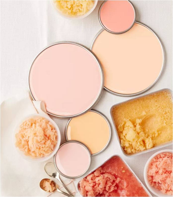
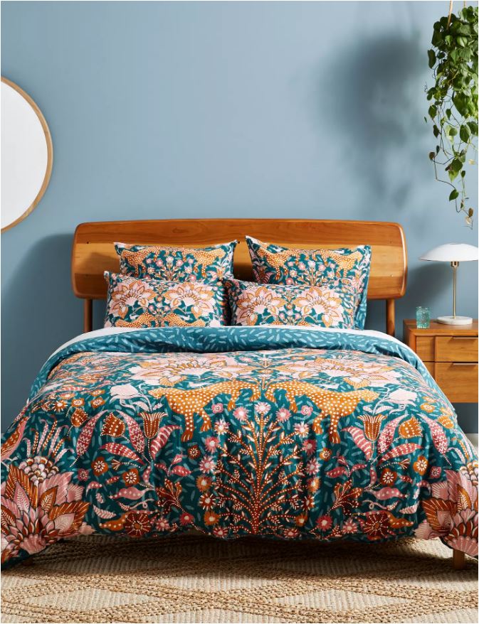
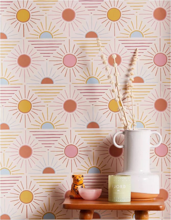
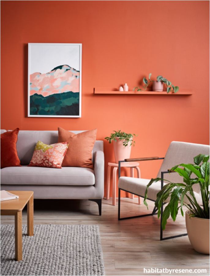
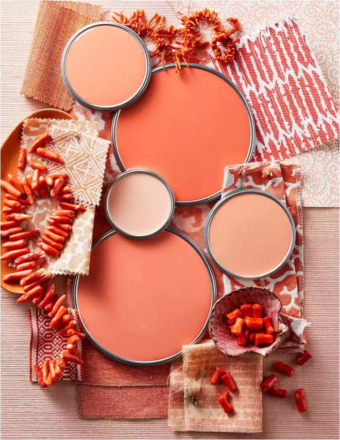
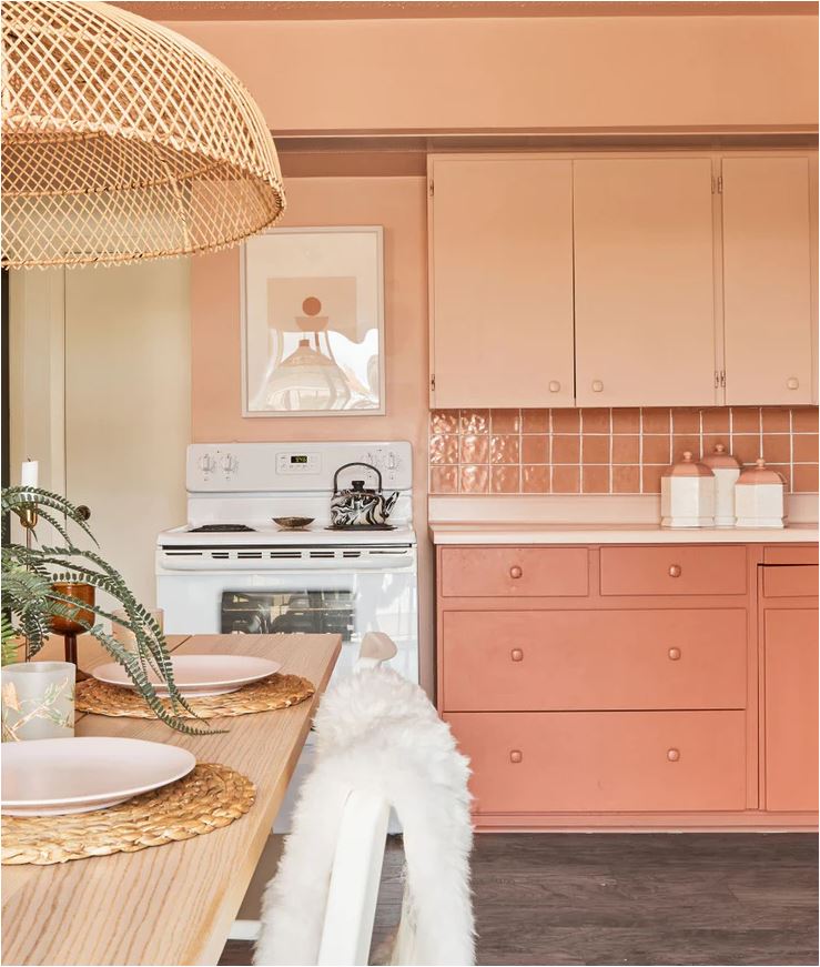
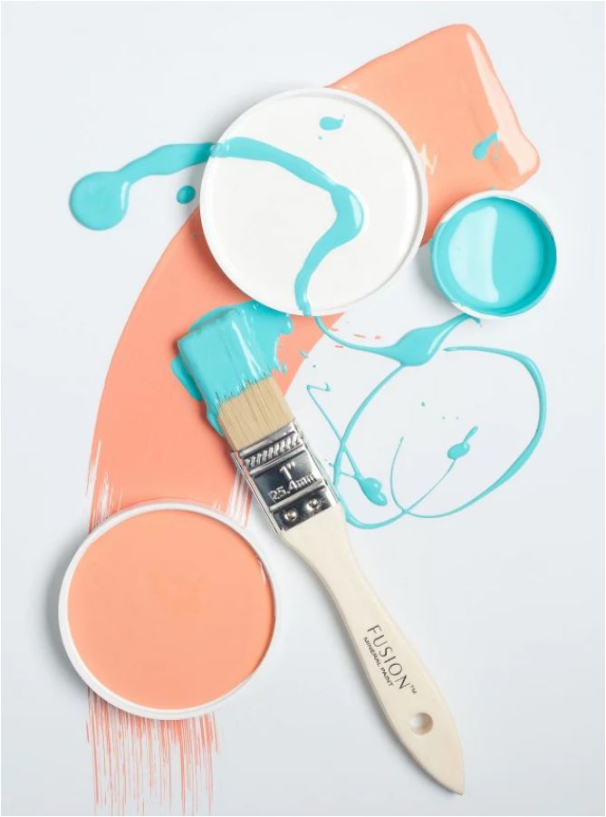
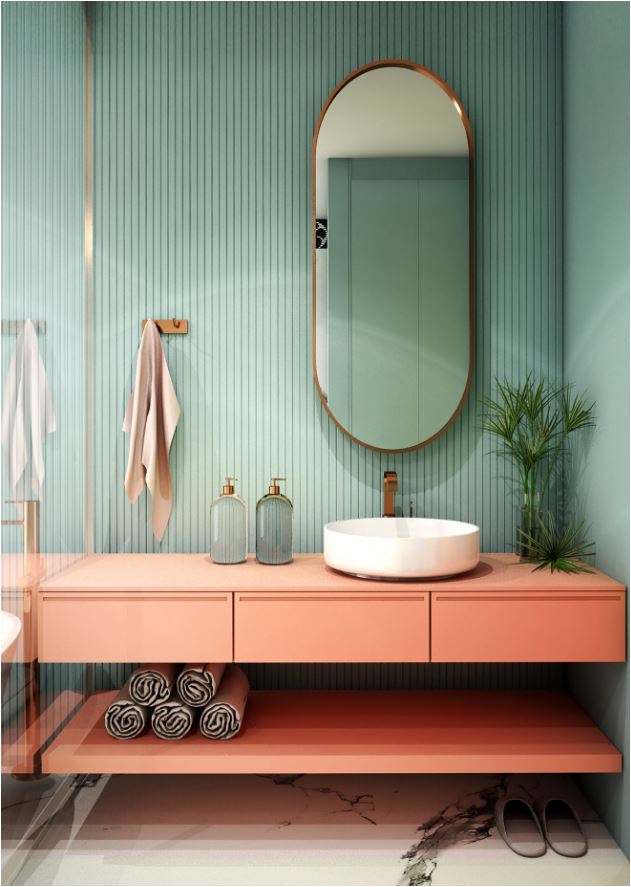
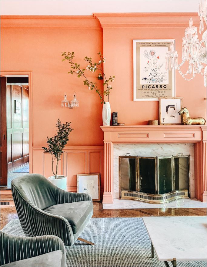
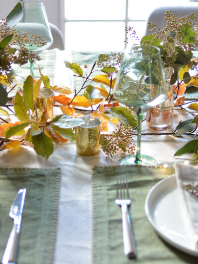
In the 1980s, the peach and turquoise palette had a big moment, and again we’re experiencing a resurgence of the analogous color palette of peach, apricot, burnt orange, and honeyed yellows. These colors are everywhere in retail, sometimes referred to as desert hues or boho colors when more muted.
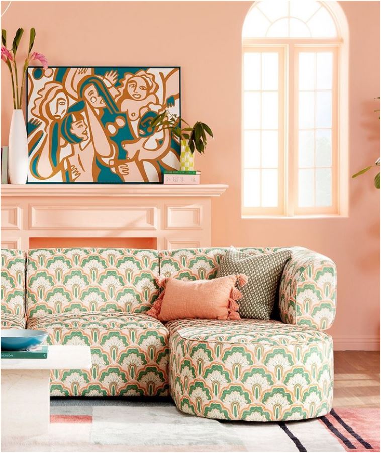
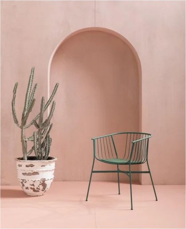
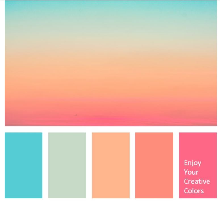
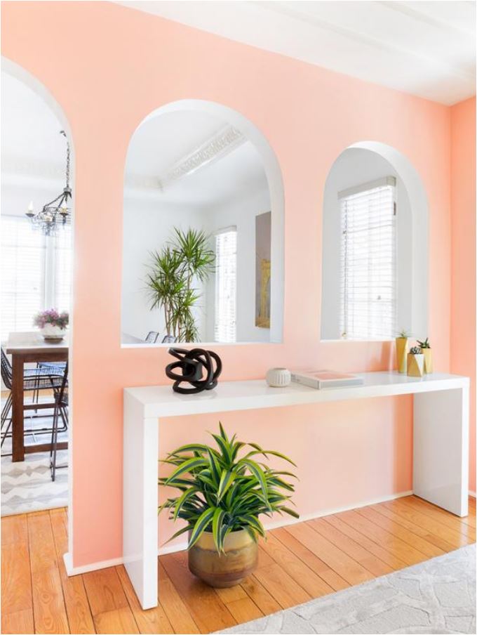
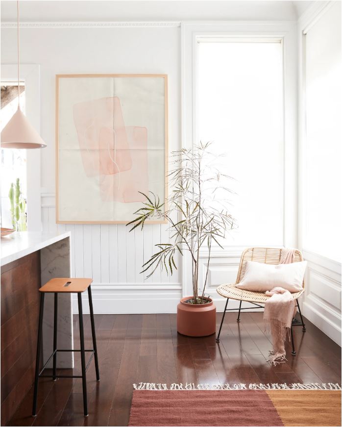
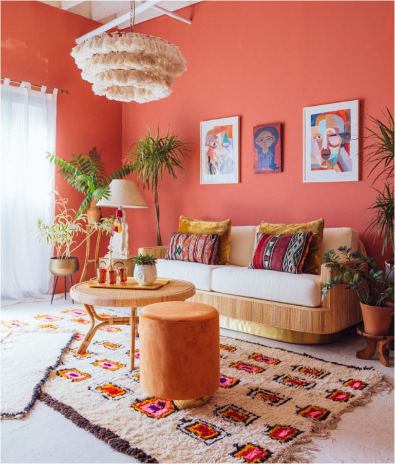
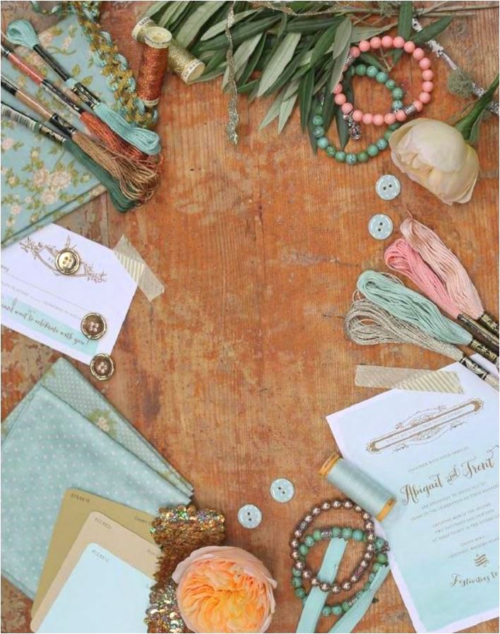
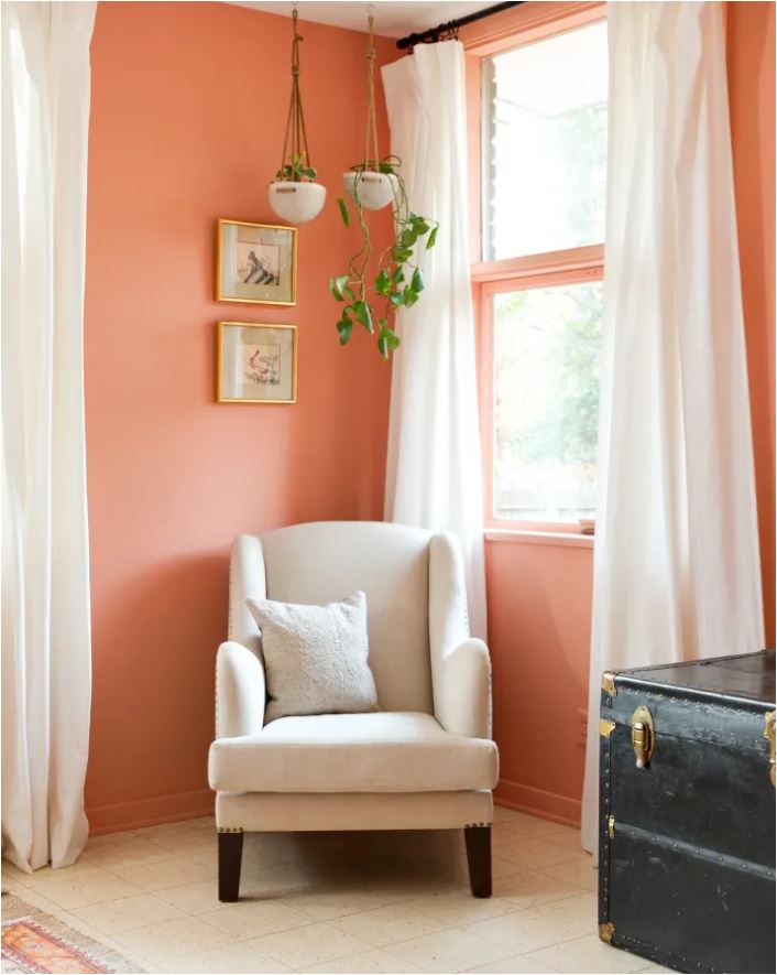
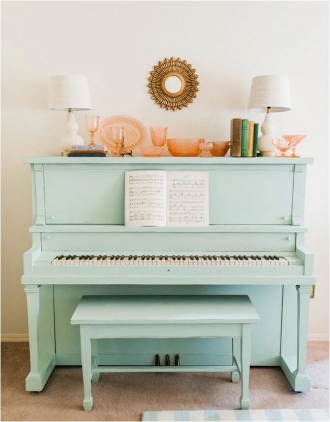
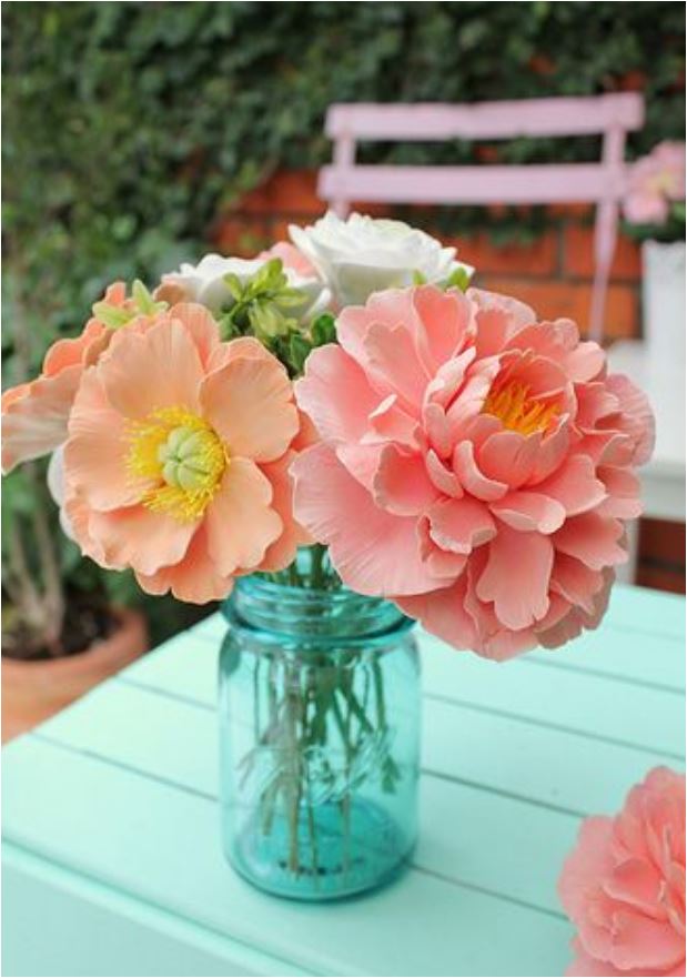
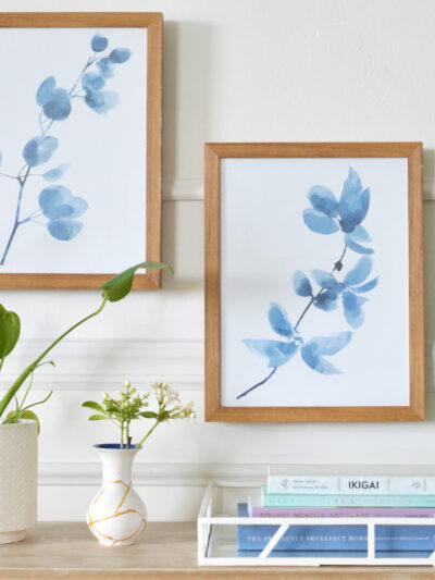
Summer brings out more the saturated versions of these colors and when paired with a touch of mint or aquamarine, the cooler blues and greens offer a nice contrast the warmer peach hues. Notice how green plants looks especially cool against apricot walls, and how pale turquoise always looks lovely with pinks and apricots. They are complements on the color wheel so it makes perfect sense. Enjoy these spaces and vignettes of sunset colors.

via hgtv
via bhg
via bhg
via domino
via wit & delight


Beautiful color palette, the room you’re creating with these colors will be gorgeous!
I love the pops of color!