I’ve had dozens of emails asking me about this kitchen remodel from last year, specifically regarding the cabinet color and my answer has always been, “It’s the manufacturer’s color: Oat by Thomasville.” But the follow up question I get is, “OK, well do you know a paint color match?”
Now I do!
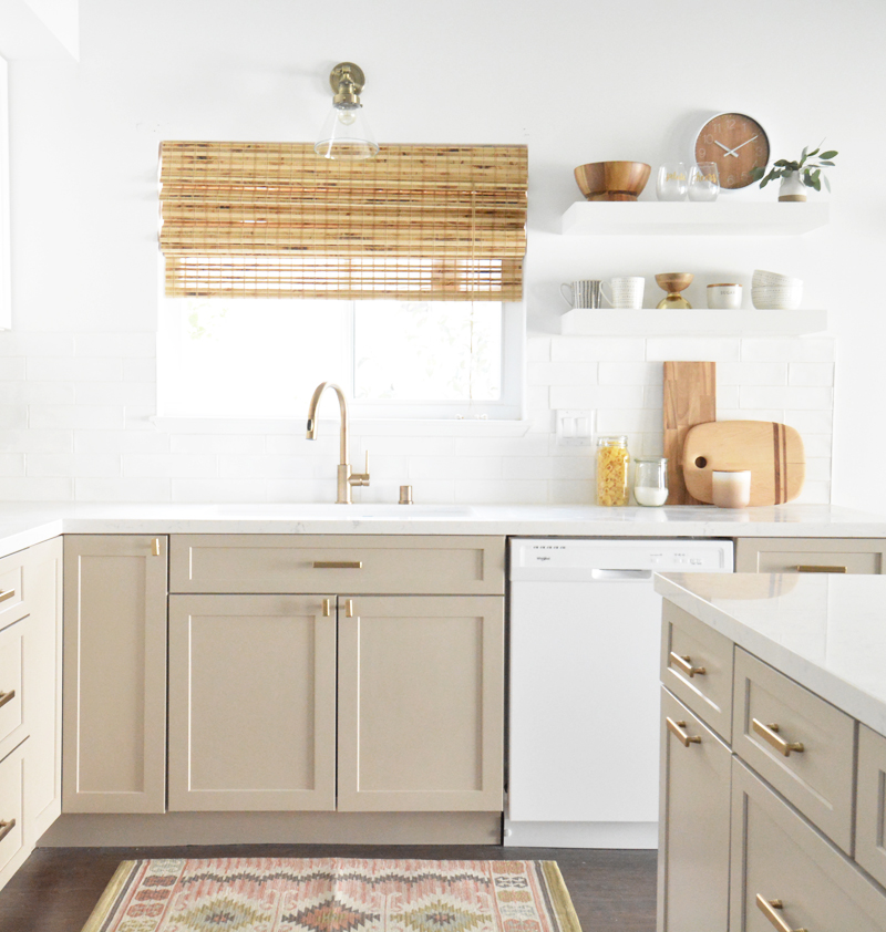
Some might call this color greige, some may call it mushroom, some may even think it’s khaki but I have always called it taupe, a color that’s the perfect balance between tan and gray, and a desirable neutral. On cabinets it looks amazing paired with matte brass hardware.
So I visited all my local paint suppliers, grabbed about a hundred taupe-ish swatches, then grabbed the cabinet sample and compared them all. (This image was taken under the florescent lights at Home Depot. Note I brought them all into the natural light outside for a true comparison resulting in odd looks from passersby wondering what the hell I was doing.) :)
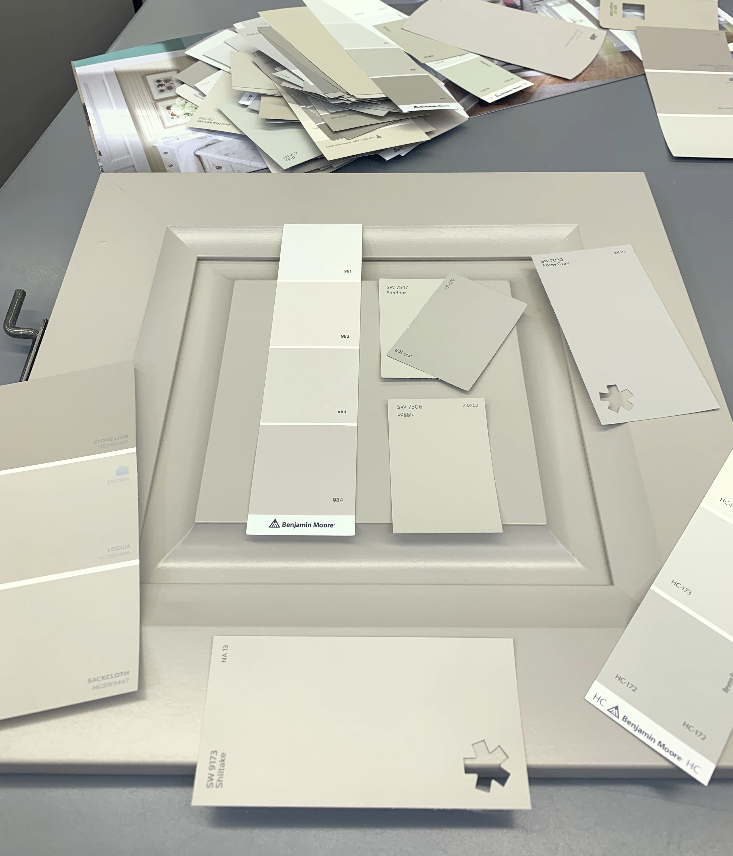
The colors in natural light that are closest match to my Oat cabinets are 1) Sherwin Williams ‘Shitake’, 2) Benjamin Moore Affinity ‘Pashmina’, 3) Benjamin Moore ‘Stone Hearth’, and 4) HG Sherwin Williams ‘Loggia’.
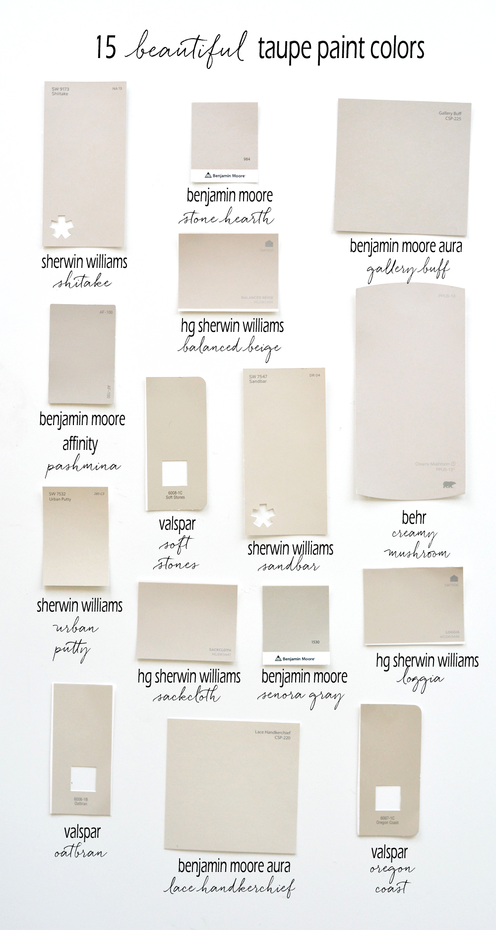
Finding a great taupe is a tricky but not impossible. You don’t want green or yellow or lavender undertones. I narrowed down a great collection of taupe colors for you to choose from!
If you’re looking for a pure taupe, consider these fifteen paint colors:
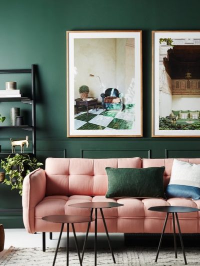
In addition to cabinets, taupe is a really great color for a home’s exterior!
I’m considering doing this paint swatch color matching as a series, is there any color you’re looking for that I can help with? A perfect slate blue perhaps?
I’m thinking of that hue for a bedroom so it may be next…
.


HI ,
I’m from Australia and have had cabinets painted this color for that last 15 years. They always look fabulous and while the kitchen looks wonderful as a neutral, you can add pops of brighter colors – hot pink or navy or green colors to the room for a change and it still looks great. I have a Calacatta marble bench top and the colored cabinets work beautifully together.
The color I used is an Australian paint brand – Dulux paints Russian toffee. A lot of stores can look up the mix of color and recreate it in another paint brand.
I hope this information can help someone
Wow Cathy you were way ahead of the trend! I always found tan to be too warm and gray to be too cold so I love taupe (or greige) it’s a balanced neutral that works with so many colors as you said.
I would love to see a picture! It sounds wonderful.
I used Loggia on my kitchen cabinets and all the trim in our lake cabin. It really is a perfect greige. In the kitchen, I also have an island painted Salty Dog. They look great together.
So great to read this Peggy, I really like Loggia too!
When I saw this post, I couldn’t believe my eyes because I just had my kitchen cabinets professionally painted last week in what I had hoped would be a beautiful taupe color, but instead it looks like greenish-gray to me, especially at night. I think it’s partially lighting, but I wish I had waited another week before I chose the paint color so I would have seen this post first! I have always loved the color taupe, but it is a tough color to get right. I previously painted a piece of furniture in Behr Creamy Mushroom and absolutely love it, but when I sampled it on my kitchen cabinets, it had a lot of pink undertones, so we ruled it out for this project. Thanks so much for writing this post! Although now I may have to repaint my cabinets with one of the colors you recommended. Sigh.
Kim – careful…a few of these colors also have pink undertones (which I think is more of a taupe issue and less of a griege issue) I painted my island Stone Hearth and while it looked beautiful at night it was definitely pinkish red in the day ;( I did repaint them to SW Amazing Gray which is very similar to Pashmina it turned out slightly cooler. Both skew slightly warmer at night in the incandescent light. What color did you paint yours? I also have Dune White on the perimeter and I love it.
Thanks for your comment Maurie, it’s so interesting how paint colors change in different light, in different spaces, and next to different colors!
Thanks for your feedback, Maurie. I painted my cabinets a custom color, which was a 50/50 mix of SW Anew Gray and SW Perfect Greige. I absolutely loved the Anew Gray in a kitchen I saw on Houzz designed by Tobi Fairley, but the color looks very different in my house, especially at night. Here’s a link to the SW Anew Gray kitchen, in case anyone is interested: https://www.houzz.com/photos/contemporary-condo-transitional-kitchen-little-rock-phvw-vp~30660375
I will also check out the SW Amazing Gray on my quest to get it right! :) Glad to hear you’re happy with your finished cabinet colors.
So interesting how colors reflect differently in different spaces! I think you should try Shitake or Pashmina, they are beautiful! So sorry about having to repaint…. it is true, trying a bunch of samples is the key to getting it right.
I love Valspar’s Oatbran, We have a territorial style home with travertine floors. It is a beautiful color to compliment my artwork and furnishings.Easy to live with color that is the perfect balance of warmth and cool.
Thanks Glenna for letting us know Oatbran is great!
Colors are a funny thing! I am wanting a beigeish color that offers some color that you can see but not too dark. I tried Sherwin Williams OATBRAN and it is a nice “light” shade. VERY light…Seemed perfect on the paper paint chip after holding it against my wall and floors. After opening the sample bottle it did look pretty light. Tried the sample on the wall (south facing with window and during more sunny part of day). It did not add much color. There was only slightly more color on north facing wall. Back for more.
Correcting my OATBRAN sample reply: I said OATBRAN was Sherwin Williams but it was a Valspar.
Yes Pashmina is in actual fact exactly one shade darker than Revere Pewter making it a green grey not a taupe. Stone Hearth, Ranchwood, Ashley Grey, Kingsport Grey are all taupes, however even taupe will look green if it’s paired with an even pinker surface like pink beige tile for example.
Thank you Maria! Pashmina is SO great and thanks for the additional taupes, you’re the expert!
Hi Kate, A fellow Sonoman here. I’m remodeling my kitchen and will be buying white appliances. I’m debating between slate blue or white cabinets. So I’d love slate blue ideas. Would also interested in white paint to use with white appliances. Thanks for your blog. Lots of great info.
We have Pashmina in our master bedroom and the entire basement and it’s PERFECTION!! Great post.
So great reading this Rebecca, thank you for sharing!!
I am looking for an exterior color to go with my brick exterior. My brick is not the nice type that is one uniform color. Instead it is a combination of three maroons with one that is slightly brown. Thoughts?
For s lighter version of the same look we painted our kitchen cabinets Farrow and Balk Shadow White. Countertops are Danby marble and the island is dark wood. We love it!
Kate, I love this! How many times does someone come into your home and say wow! What color is that? And you have to say something like SW-6106, lol. I’m not sure people really understand that every setting is different and it is important to bring the swatches to your own home and see how the lighting in your own individual space impacts that chosen color. Whether it be for the orientation of natural light or just the given light source.
Hi Kate, first of all thank you so much for this great colorful post :) I utilized Loggia on my kitchen cupboards and all the trim in our lake lodge. It truly is an ideal greige. In the kitchen, I likewise have an island painted Salty Dog. It look extraordinary together.
I just used Shiitake in my entryway, hallway and family room and it is gorgeous! I was super nervous at first bc I was use to peachy and burnt orange and plum colors. So the neutrality of it freaked me out. BUT……it’s gorgeous!!! I went from a Tuscan colored home to a Coastal and it’s so bright and stunning now! Highly recommend Shittake!
So great to read this Clara, Shitake is a beautiful neutral, so happy it works in your home!
Hi, Kate –
I’ve been on a quest for *years* to find a blue-tinted white paint. Every time I think one might work, I put it up and it just looks like a baby blue pastel. I’d love to see what you would choose, for this or other colors people are wondering about.
QuingyuanMama, I have found that picking a light grey color with a slight hint of blue works much better when I’m looking for a pale light blue color. I’ve found that when I like a light blue color on the paint chip, it usually ends up looking pastel baby blue on the wall. Sticking to a grey with blue undertones seems to give me the color I’m going for, even though I wouldn’t necessarily choose that greyish-blue color from the paint swatch. If you have a fan deck from a paint company, look through the greys and you can usually find one with blue undertones. Good luck!
We have this sandbar taupe on our kitchen cabinets and they look amazing! I can see you have paired it with some nicely muted kilim rug so thinking of adding one for ours although we already have a faded vintage oriental runner and it works too! Thank you!
Hi Katie – I am painting kitchen cabinets. They are currently honey oak and the floor is honey oak too. Im debating between Shitake or Loggia. Lots of N and S facing windows. Any thoughts? Thanks.
my best advice is to try samples of both and look at them in changing light throughout the day. light is a funny thing, it’s different based on latitude, longitude, whether you’re west, north, east, or south facing! so choosing the right taupe is never universal, but that’s what makes design so fun. :) take a look at a few samples and decide which one is perfect for YOU! xo
Hello there!
In the very first image, I love how the cabinets turned out well with the brass (i’m guessing) of the cabinet handles and the faucet.
My question is, the what kind of natural light exposure does your kitchen get? is this south-facing, north-facing, east or west?
I would love to try this out in my masterbath, which gets light from west and northfacing.
Thanks in advance!
Lily